Bootstrap-style grid system for Tailwind CSS — without conflicts
🔗 Website: tailboot.jayyu.in | NPM: tailboot-lite
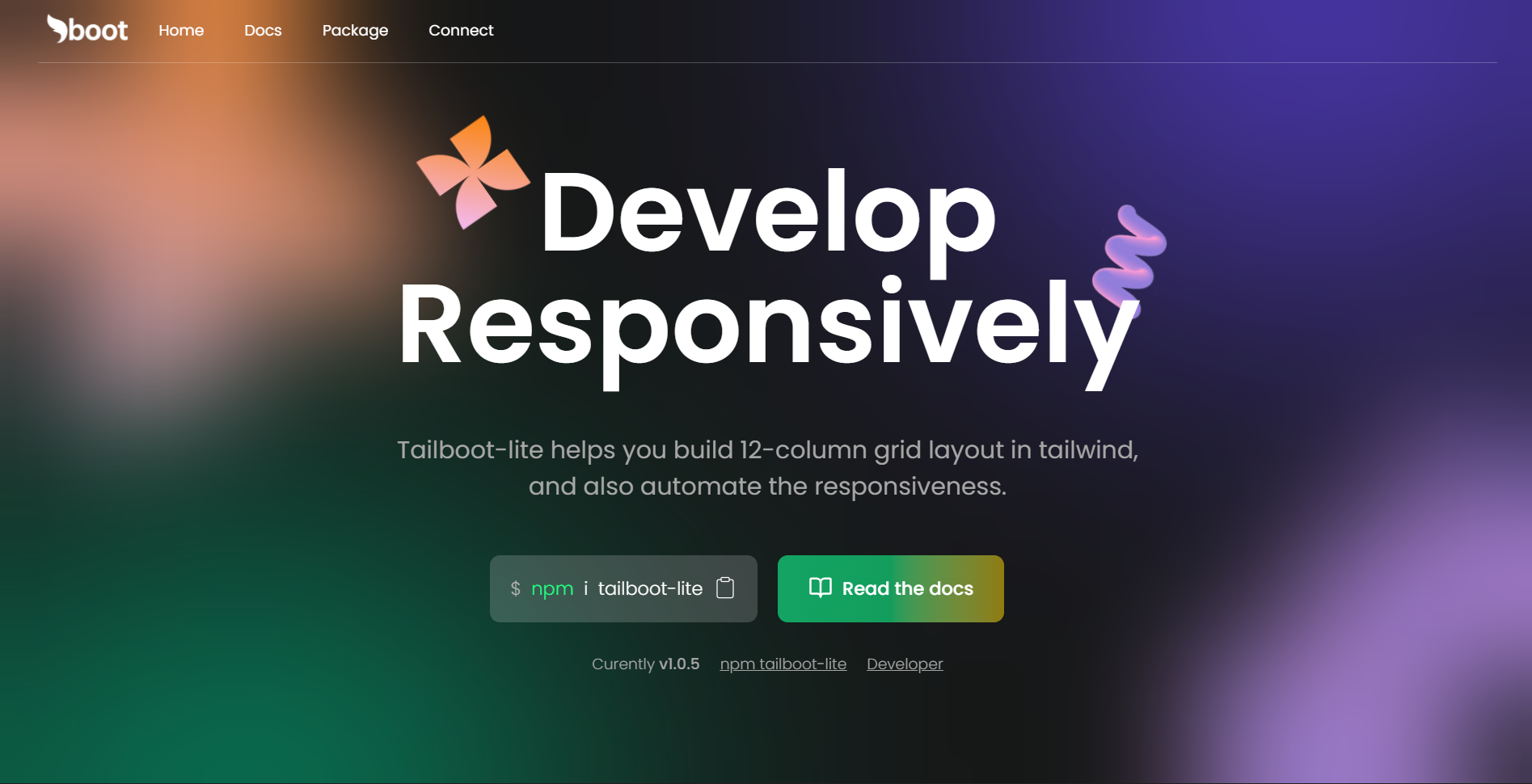
Tailboot-lite is a lightweight utility package that brings Bootstrap’s familiar 12-column grid system to Tailwind CSS, along with automatic responsiveness for sizing, spacing, and typography. It is designed to work seamlessly with Tailwind without introducing Bootstrap or causing style conflicts.
- Familiar
col-lg-x,col-md-x,col-sm-xsyntax - No Bootstrap dependency
- No Tailwind conflicts
- Clean and readable layout structure
-
Enable responsiveness with a single
.responsiveclass -
Automatically scales:
- Font sizes
- Widths and heights
- Spacing and component dimensions
-
Reduces the need for repetitive responsive utility classes
Install via npm:
npm install tailboot-lite<link rel="stylesheet" href="tailboot-lite/css/responsive.css" />import 'tailboot-lite/css/responsive.css';Tailboot-lite replicates Bootstrap’s grid behavior while remaining fully compatible with Tailwind CSS.
<div class="row">
  <div class="col-lg-6 col-md-12">Content</div>
  <div class="col-lg-6 col-md-12">Content</div>
</div>- Large screens (≥ 1000px): Each column occupies 6 of 12 columns (50% width)
- Medium screens (750px – 1000px): Each column spans full width (12 of 12)
- Smaller screens: Columns stack vertically by default
| Class Prefix | Screen Width |
|---|---|
col-lg-x |
≥ 1000px |
col-md-x |
750px – 1000px |
col-sm-x |
500px – 750px |
col-x |
< 500px (default) |
x can be any even number between 2 and 12, representing the number of columns out of 12.
Responsive design in Tailboot-lite goes beyond layout. It automatically scales all REM-based values across screen sizes.
Add the responsive class to your root element:
<html class="responsive">- Assumes
1rem = 10pxinstead of the default16px - Makes spacing and sizing calculations easier
- Automatically scales UI elements as screen size changes
Instead of:
52px = 3.25remYou can use:
5.2remYou can still use Tailwind’s responsive utilities when needed:
<div class="w-[20rem] sm:w-[10rem]">
  Hello
</div>Free to use. Attribution is appreciated 😊.
Made with 💓 by Jayesh Verma (NIT R)